
Story behind the record sleeve: Go 2 (1978) - XTC
This is the final 'Story behind the Record Sleeve' by our employee Gerrit-Jan Vrielink. This column originated at the beginning of the Corona pandemic and has been running for more than 2 years due to its success. We thank Gerrit Jan for all his time, energy and enthusiasm and Alex Driessen for the English translations!
I've been asking myself for quite a while: which record sleeve is best suited for my last blog? A cover of Yes, the group I was mad about when I was a kid? From Peter Hammill, whom I admire immensely? From Radiohead, whose 2016 concert will forever remain with me?
The answer is: none of the above. There is only one cover that is suitable for the closure and that is Go 2 by XTC. It is in fact the only album cover that deals with the phenomenon of album covers. Brilliant English humor, created by design agency Hipgnosis.
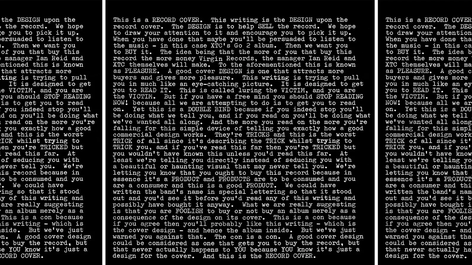
It starts with: This is a RECORD COVER. This writing is the DESIGN upon the record cover. The DESIGN is to help SELL the record. We hope to draw your attention to it and encourage you to pick it up.
A record sleeve isn’t just to protect the record itself. At the very beginning of the album's development it was. Until the idea came up in the fifties to make the album cover more attractive. Usually that was a photo of an artist smiling. Similar to an advert for toothpaste.
As of then, the cover was used to make a potential buyer curious about the music. Read on to find out the text on this cover:
When you have done that maybe you’ll be persuaded to listen to the music - in this case XTC’s Go 2 album. Then we want you to BUY it. The idea being that the more of you that buy this record the more money Virgin Records, the manager Ian Reid and XTC themselves will make. To the aforementioned this is known as PLEASURE. A good cover DESIGN is one that attracts more buyers and gives more pleasure.
A good record sleeve should stand out and match the buyer's needs. For progrock aficionados, artists like Roger Dean were employed to design covers. In the beginning, design agency Hipgnosis, who also made this cover, primarily made Pink Floyd covers. Characteristic of their style is the collage-like cover with photos as starting points. In some cases, the cover became more important than the music itself. One bought an LP for its cover, not necessarily the music. But actually one has become a victim of a commercial trick that was used. The text on “GO 2” describes it this way:
This writing is trying to pull you in much like an eye-catching picture. It is designed to get you to READ IT. This is called luring the VICTIM, and you are the VICTIM. But if you have a free mind you should STOP READING NOW! because all we are attempting to do is to get you to read on. Yet this is a DOUBLE BIND because if you indeed stop you’ll be doing what we tell you, and if you read on you’ll be doing what we’ve wanted all along. And the more you read on the more you’re falling for this simple device of telling you exactly how a good commercial design works. They’re TRICKS and this is the worst TRICK of all since it’s describing the TRICK whilst trying to TRICK you, and if you’ve read this far then you’re TRICKED but you wouldn’t have known this unless you’d read this far. At least we’re telling you directly instead of seducing you with a beautiful or haunting visual that may never tell you. We’re letting you know that you ought to buy this record because in essence it’s a PRODUCT and PRODUCTS are to be consumed and you are a consumer and this is a good PRODUCT.
As an extra lure, logos were developed for the name of the band. Roger Dean's Yes logo is one of the best known. This cover also has some comment on logos:
We could have written the band’s name in special lettering so that it stood out and you’d see it before you’d read any of this writing and possibly have bought it anyway. What we are really suggesting is that you are FOOLISH to buy or not buy an album merely as a consequence of the design on its cover. This is a con because if you agree then you’ll probably like this writing - which is the cover design - and hence the album inside. But we’ve just warned you against that. The con is a con. A good cover design could be considered as one that gets you to buy the record, but that never actually happens to YOU because YOU know it’s just a design for the cover. And this is the RECORD COVER.
The story continues on the back. That the album was made by XTC. That it is their second album and that you have to go and listen for yourself to know what kind of music it is.
It reminds me of the early days of Talking Heads in the late seventies, but then very British. There’s also some mentioning about an insert with extra information that is included. A gadget for the avid record collector, often lost over the years.
The cover confirms what I've been thinking for some time: record covers are a world apart. That was one of the motivations for starting this blog in the spring of 2020. Another motive was the lockdown, the Boerderij-less Era. Remember? That time has passed and will never return, hopefully. Once again we have live music!
There is nothing more beautiful than a concert by a good artist in a great venue. Not even writing blogs about record covers. In the coming months I can be spotted at many gigs and festivals. And of course as a stage manager at the Boerderij. It feels like the proper time to put an end to the blog series 'The story behind the record sleeve'. I enjoyed doing it. The heartwarming reactions to the stories over the past two years have always been an incentive to pull a new cover from my record collection.
Gerrit-Jan Vrielink